An Analysis of Zipongo’s Orderwell App
December 1, 2017
My Understanding
Zipongo is a late-stage startup that provides company employees customized healthy meals. Orderwell is one of Zipongo’s product offerings that focuses on the pickup and delivery of healthy foods. Zipongo has raised more than $28MM in funding and has many prominent clients.
Initial Analysis
From the employee perspective, I thought of four primary criteria for determining which food I would consume:
- Healthy
- Taste
- Convenience
- Price
Zipongo is competing in the healthy category. However, OrderWell also focuses on a convenience element that many on-demand apps focus on these days.
I took a brief look at potential competitors in the healthy, convenience food space:
- Healthy Dining Finder (https://www.healthydiningfinder.com/)
- HappyCow (https://www.happycow.net/)
- Zomato (https://www.zomato.com/healthy-food-restaurants-near-me)
- HealthyOut (https://itunes.apple.com/us/app/healthyout-healthy-restaurant-nutrition-guide/id566409966?mt=8)
- Yelp (https://www.yelp.com/search?find_desc=Healthy+Food&find_loc=Los+Angeles%2C+CA)
- UberEats (https://www.ubereats.com)
- DoorDash (https://www.doordash.com/)
I viewed each competitor website and analyzed their products. Some common themes I found included:
- Providing delivery from nearby restaurants
- Providing a rating system
- Providing user written reviews
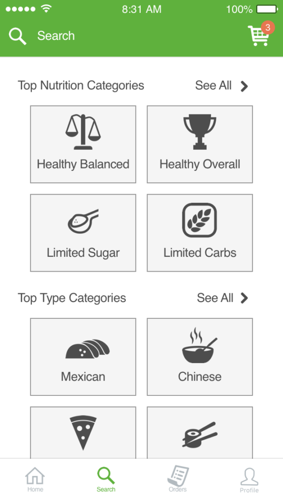
- Providing the ability to filter from different types of food (e.g. Mexican, Chinese, etc…)
These themes are interesting. As a user who care about conveniently healthy eating, I likely prefer some of the following:
- Ability to search and browse “healthy” foods
- The ability to learn what “healthy” is for me and my family
- The ability to define what “healthy” means for me and my family
- The ability to schedule more than one order for “healthy: days or weeks
- Ability to deliver from the app
- Ability to track my order
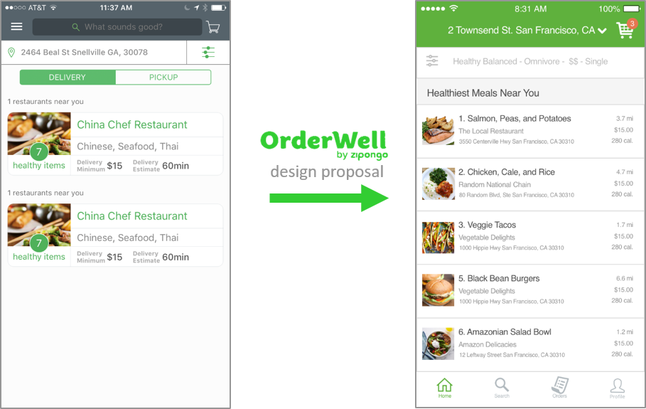
Thus, based on initial analysis, there are some gaps in the market. Perhaps this could be a subscription business for users where they decide what they want delivered throughout the day? Or perhaps there’s an element that gamifies what is healthy for a mother and her 5-year old? Exhibit B shows one proposed iteration of a highly differentiated healthy food delivery app based on initial research.
Proposed Changes
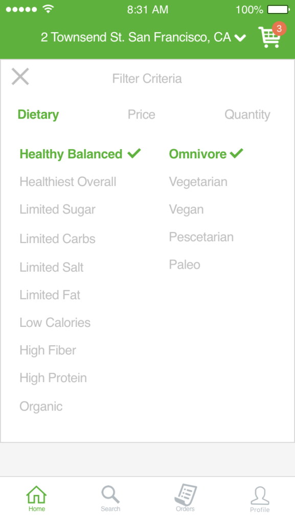
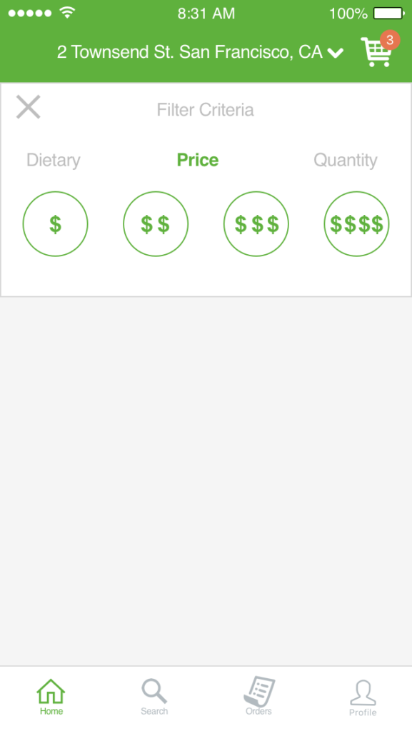
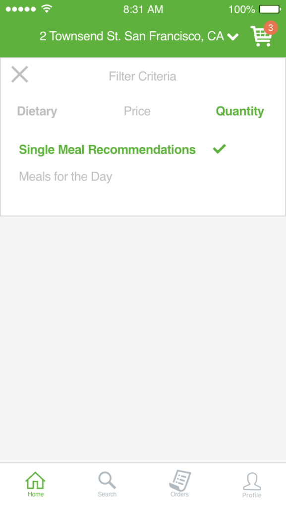
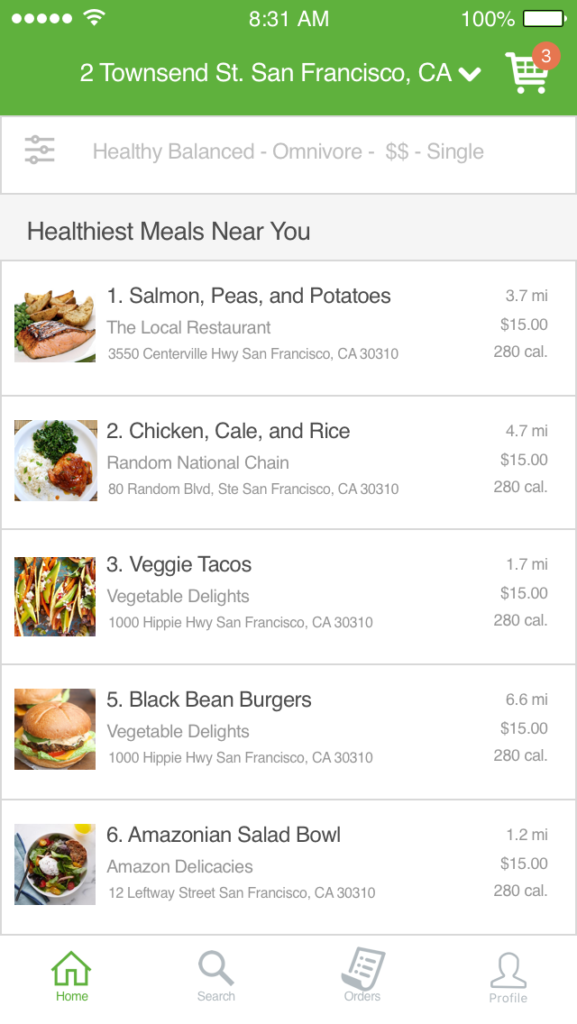
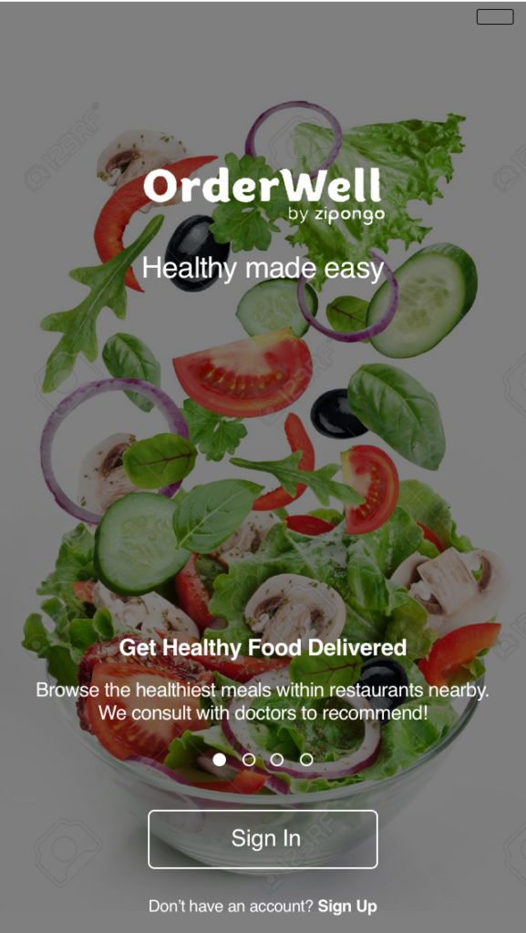
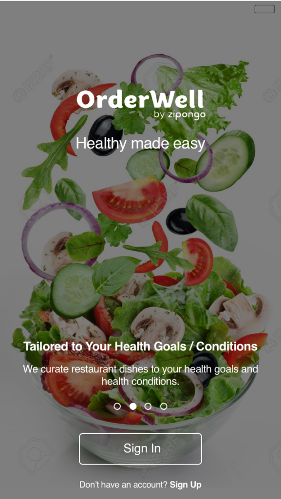
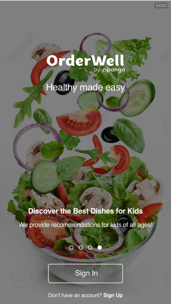
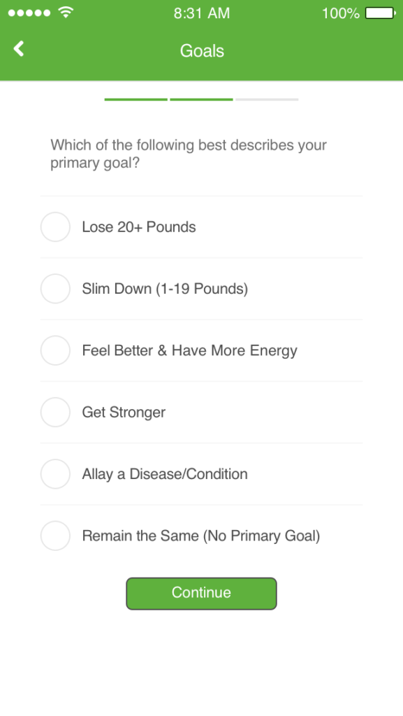
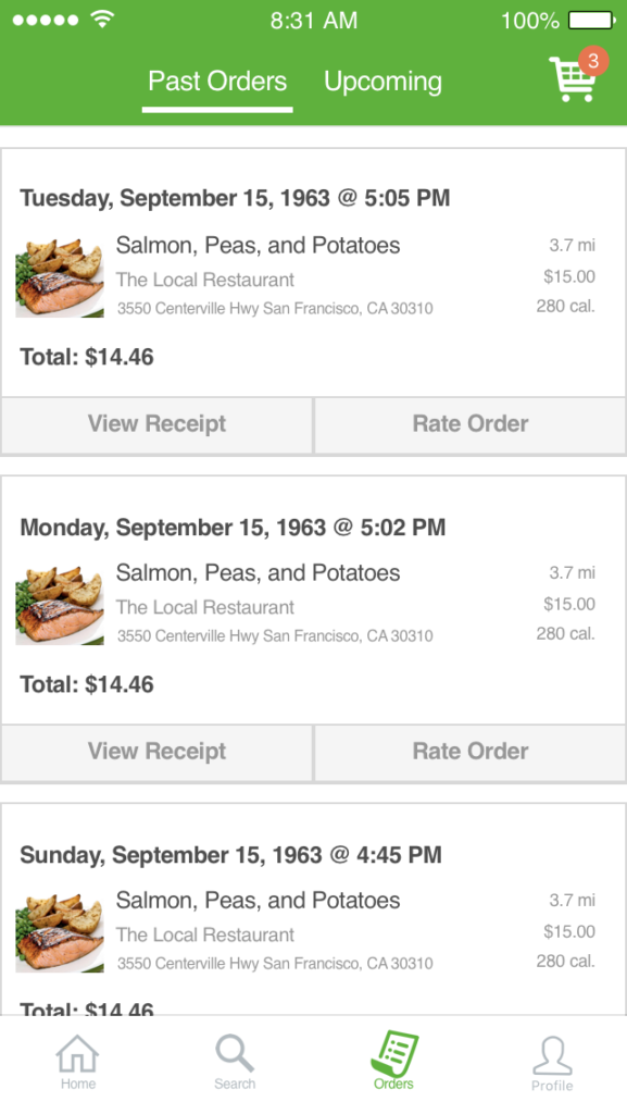
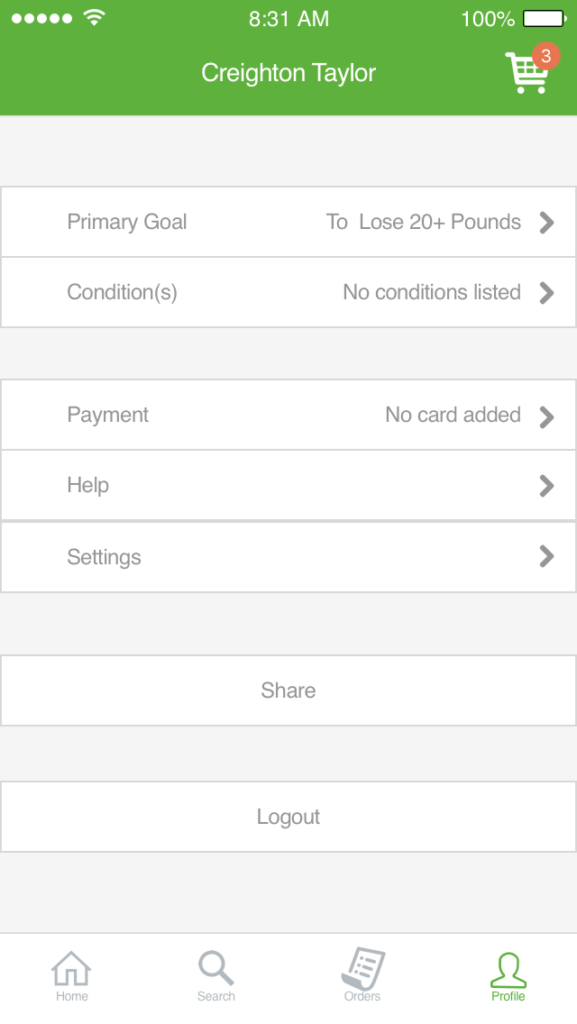
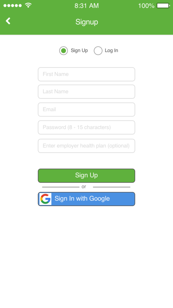
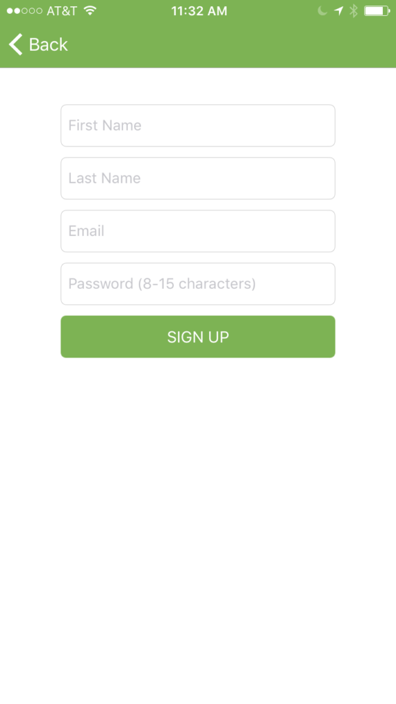
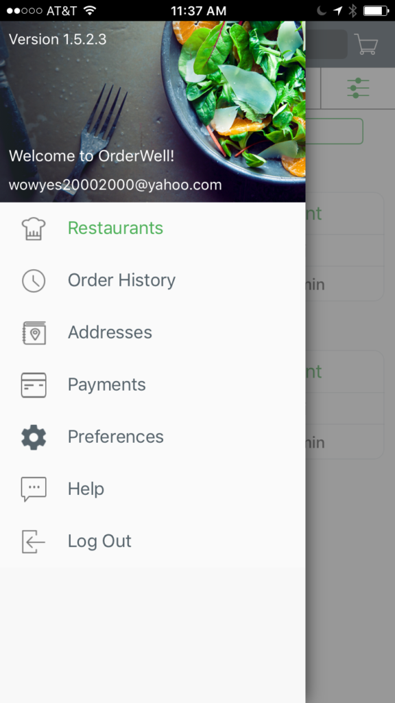
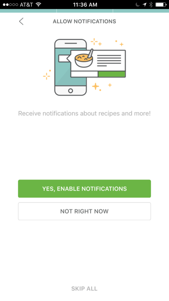
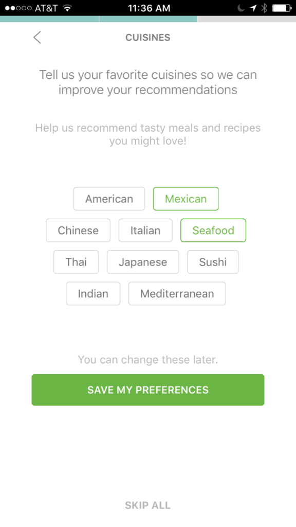
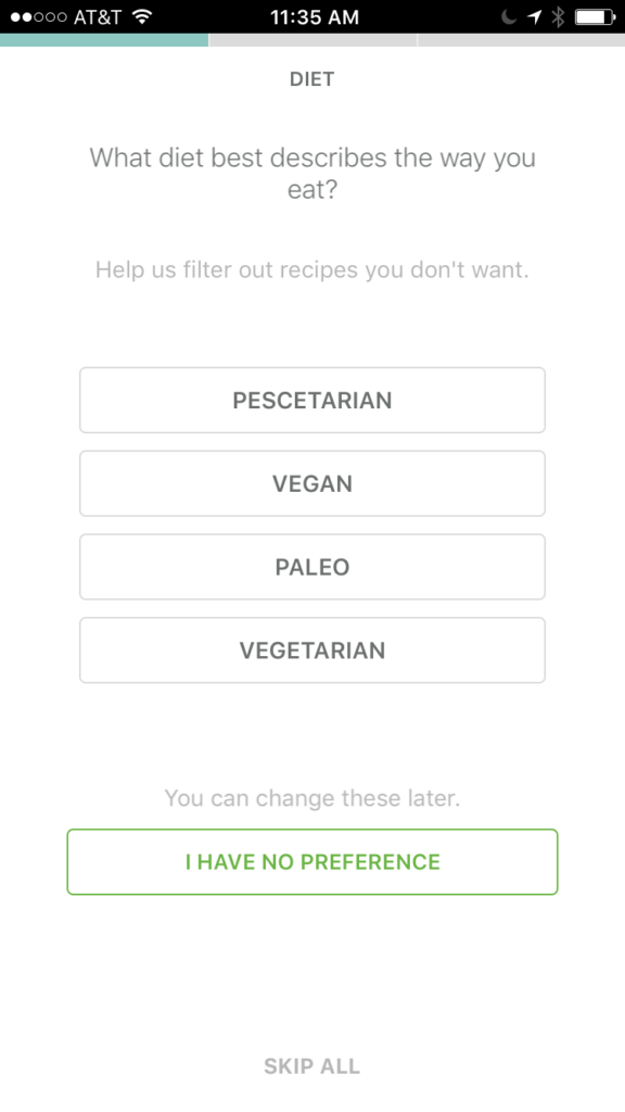
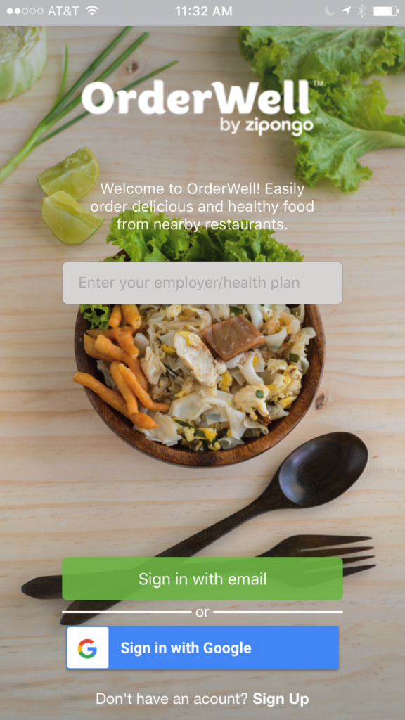
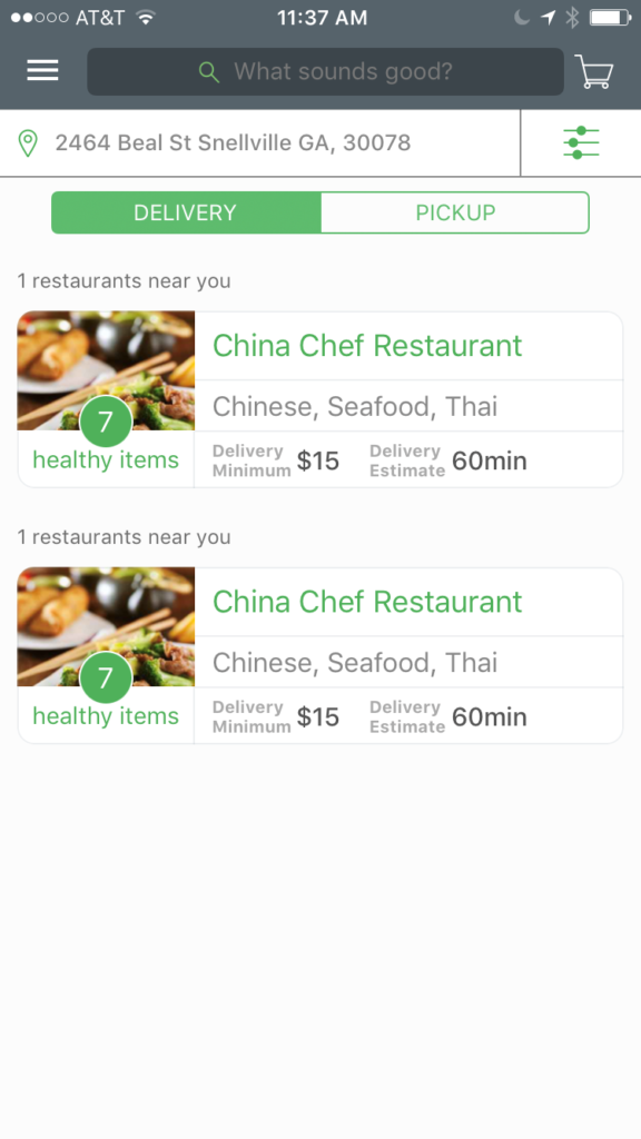
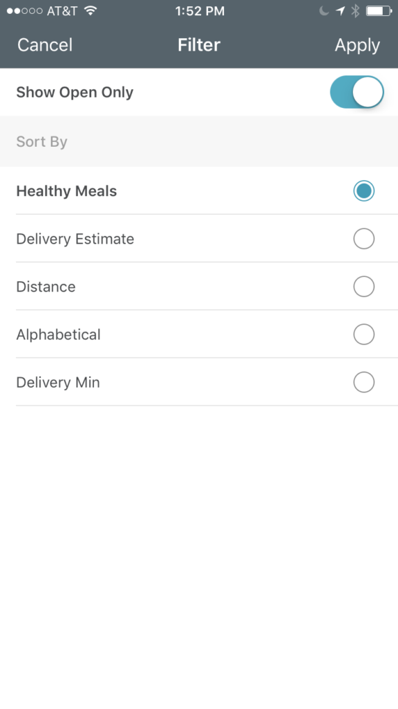
Appendix A provides screenshots of the current OrderWell app. I designed a different OrderWell app in Appendix B using Sketch. The designs are not mean to be a scaled down MVP, as the filtering functionality alone can easily become quite the project. Instead, the designs are meant to depict a proposal that I believe will significantly improve the user experience, increase conversions, and increase referrals.
Key product differences include:
- Focused on delivery rather than delivery and pickup to piggyback on consumer trends
- Focused on meals rather than restaurants since restaurants often have diversified menus
- Ability to filter to your specific health conditions or goals
- Ability to filter by nutrition metrics
- Ability to filter the best dishes for kids of all ages
- Filter tags instantly show user optionality in ordering meals on home screen
The key funnel differences include:
- Value proposition described on launch screen
- Tab bar eliminates the extra click necessary from the side bar navigation
- Order tab allows users to switch over to upcoming orders and track progress
- Ability to filter the best dishes for kids of all ages
- For second onboarding screen, switch question from meal types (e.g. Mexican) to primary goal (e.g. lose weight) to highlight the app’s competitive advantage in goal-focused healthy eating.
Appendix A – OrderWell App Today
Appendix B – Proposed Orderwell Mobile App
